Introducing Denver Summit FC
Denver Summit FC is Colorado’s professional women’s soccer club and the National Women’s Soccer League’s 16th franchise. We are building toward a global standard of excellence — on and off the pitch — through intentional engagement with the city we call home. Led by owner Rob Cohen and a committed group of local and national investors, the club is grounded in local values and sustained by broad belief in the future of the game.
Created by the community, for the community, Denver Summit FC was born from a grassroots movement of Denver supporters who believed women’s soccer belongs at the highest level in this city — a belief that continues to shape who we are today.

Our Name
Denver Summit FC reflects who we are, where we’re from, and where we’re going. Chosen by the community, the name represents ambition, unity, and the pursuit of something greater.
Denver Summit
Selected through the club’s Name The Club fan vote, Denver Summit earned the most first-place selections among more than 15,000 fan votes and submissions. The name speaks to both our city and our mindset—bringing people together at the summit and striving to reach new heights, on and off the pitch.
Football Club (FC)
Football Club signals our place within the global game. It reflects an international soccer identity, respect for the sport’s traditions, and an ambition that extends beyond borders.
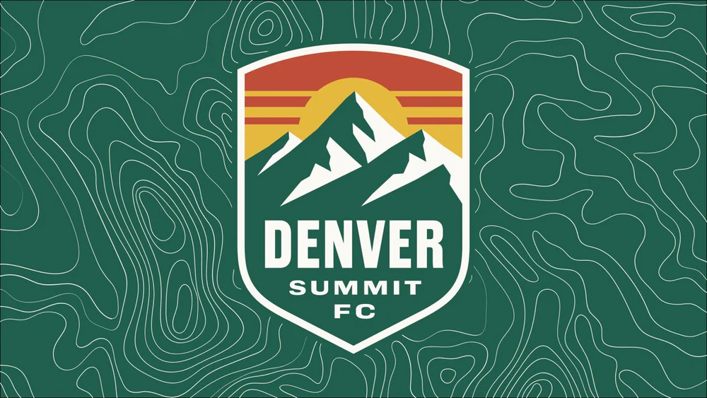
Crest Explainer
The Denver Summit FC crest is more than a mark—it’s a reflection of place, ambition, and purpose. Every element was intentionally designed to honor Colorado’s landscape, history, and the spirit of the club as we build toward the future.
Shield – The foundation of the crest is a classic soccer shield, representing tradition, strength, and pride.
Red Sky – Drawing inspiration from Colorado sunsets and the state’s iconic red rock landscapes, it captures the drama and beauty of the Front Range.
Sun – Centered in the crest, the sun represents Colorado’s abundant sunshine, energy, and optimism.
Mountains – An unmistakable nod to the Rocky Mountains and Colorado’s identity, the main peak is angled at 26° for the club’s 2026 debut.
Green & White Colors – The club’s green and white color palette pays homage to Colorado’s traditional license plates, reinforcing a sense of local pride and authenticity. These colors connect the crest directly to the state and its people.
Typography – Custom typography inspired by western expansion and regional heritage ties the crest together. The letterforms echo strength, movement, and independence—qualities that define both the region and the club’s mentality.